If you want to get your Amazon listing suppressed and tank your sales, ignoring the product image rules is the quickest way to do it. It all boils down to a few core commandments for your main image: it must have a pure white background, the product needs to fill at least 85% of the frame, and it needs to be a minimum of 1,000 pixels on the longest side to get that all-important zoom feature.
But trust me, those are just the table stakes. Getting this right is about more than just avoiding a slap on the wrist from Amazon; it's about building a professional-looking page that actually converts browsers into buyers.
Your Cheat Sheet to Amazon Image Rules
Before we get into the nitty-gritty of pixels and file formats, let's cover the big-picture rules. Think of this as your survival guide to avoid the most common, painful mistakes that get new sellers in trouble. Nail these basics, and you're already ahead of the game.
Amazon’s rules aren't there just to give you a headache. They're designed to create a consistent, clean, and trustworthy shopping experience for everyone. A perfect main image is what makes someone stop scrolling and click on your product in a sea of search results. Your other images are what seal the deal by telling a story and answering questions before they're even asked.
Main Image vs. Secondary Image Rules
Amazon plays by two different sets of rules. You have the super-strict, no-nonsense requirements for your main "hero" image, and then the much more relaxed guidelines for the rest of your images. It’s crucial to know the difference.
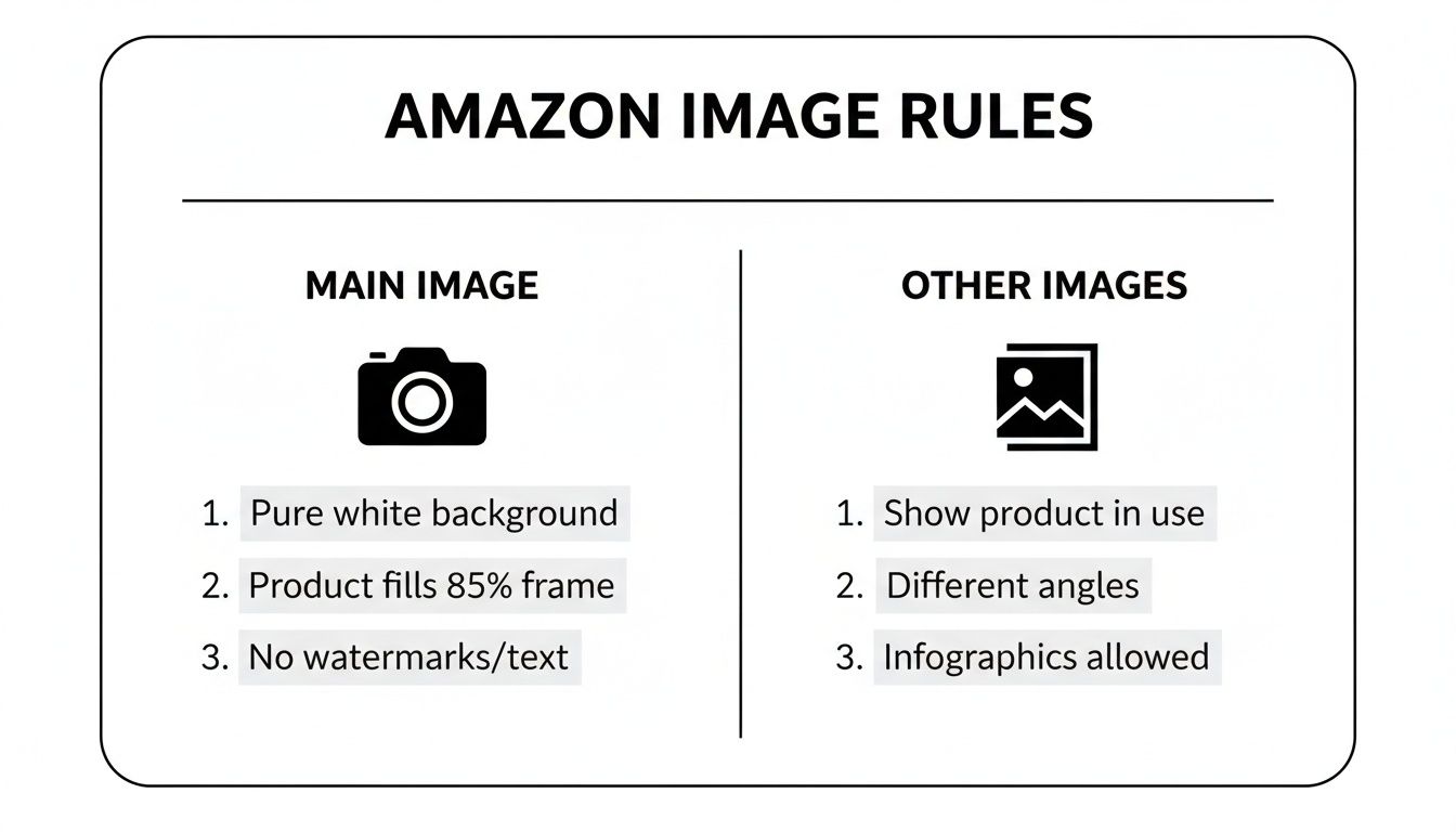
As you can see, the main image is all business—just the product, clean and simple. The other image slots? That's your playground. It’s where you can add text, show the product in action, and really sell the benefits.
To make it even clearer, here's a quick side-by-side breakdown.
Main Image vs. Additional Image Requirements at a Glance
| Requirement | Main Image (Hero Image) | Additional Images (Slots 2-9) |
|---|---|---|
| Background | Pure White (RGB 255, 255, 255) is mandatory. No exceptions. | Can use lifestyle backgrounds, different colors, or graphic settings. |
| Text & Graphics | Strictly forbidden. No text, logos, watermarks, or graphic overlays. | Allowed. Perfect for highlighting features, adding dimensions, or instructions. |
| Product Display | Must show the entire product being sold. No props. | Can show the product in use, with props, or in different environments. |
| Angle | Typically a clean, front-on shot. | Multiple angles, close-ups, lifestyle shots, and infographics are encouraged. |
| Human Models | Generally disallowed, except for clothing/wearable items. | Allowed and often recommended to show scale and context. |
The key takeaway is simple: your main image must be a sterile, studio-perfect shot on a pure white background. The additional images are where you get to unleash your creativity and persuade shoppers with context, graphics, and real-world appeal.
Understanding and following the full scope of Amazon image requirements isn't just about compliance. It directly impacts your ad performance, click-through rates, and ultimately, your sales velocity on the platform.
Cracking the Code: Amazon's Technical Image Specs
Look, beyond all the creative advice about making your product look amazing, there's a whole technical side to Amazon images that most people ignore until it's too late. This is the stuff Amazon's automated bots look for. Get it wrong, and your images get kicked to the curb before a human ever lays eyes on them. Think of it as the secret handshake to get past the bouncer.
Let's start with the basics: file formats. Amazon technically accepts a few, but let's be real—JPEG (.jpg) is the gold standard. Why? It hits that perfect sweet spot between fantastic image quality and a small file size. A small file means a fast-loading page, and in the world of e-commerce, speed is everything. A customer isn't going to sit around waiting for your giant photo to load; they'll just bounce.
Sure, you can use TIFF, PNG, or GIF. But PNG is really only good if you need a transparent background (which you can't have on your main image anyway), and they tend to be chunkier files. TIFFs are beautiful but absolutely massive—total overkill for the web. And GIFs? Amazon doesn’t support animation, so they're pretty much useless here. Stick with JPEG.
The One Color Mode to Rule Them All
Ever buy a shirt that looked like a vibrant cherry red online, only to receive something that’s more like a sad, dull brick? That’s usually a color mode problem. Amazon is strict about this: all your images must be in the sRGB (Standard Red, Green, Blue) color space.
There's a good reason for this. sRGB is the universal language of color for the internet. It ensures the colors you meticulously chose on your monitor are the same ones your customers see, whether they're shopping on a laptop, tablet, or phone. If you upload an image in CMYK (which is for printing), the colors will go haywire on Amazon, leading to a product that looks nothing like the real thing. That's a one-way ticket to bad reviews and a pile of returns.
Expert Tip: Before you export a single image, double-check that your color profile is set to sRGB. It's a two-second step that will save you from a world of customer complaints and logistical nightmares down the road.
Naming Your Files Like a Pro (So Amazon Doesn't Get Confused)
Okay, this last part might seem nitpicky, but it’s crucial. Naming your image file MyAwesomeProduct_Final_V2.jpg is asking for trouble. Amazon's system is a robot, and it needs a very specific file name to know which image belongs to which product.
The rule is simple: your file must start with the product identifier, followed by a period and the file extension.
- Acceptable Product Identifiers: ASIN, UPC, EAN, ISBN, or JAN.
- Optional Variant Codes: For different image slots (like the main hero shot or secondary images), you can add a four-character code. Common ones include
MAIN,PT01(for part 1),TOPP, etc.
The correct structure looks like this: ProductIdentifier.VariantCode.FileExtension
So, if your product's ASIN is B00SAMPLE123, your main image should be named B00SAMPLE123.MAIN.jpg. The first of your secondary images would be B00SAMPLE123.PT01.jpg. Following this rigid format ensures your images get matched to the right listing instantly, preventing bizarre errors or your listing getting suppressed. It’s simple, clean, and keeps the Amazon machine happy.
Getting Zoom Right: A Deep Dive into Image Size and Resolution
If your main image is the digital handshake, the zoom feature is where your customer gets to lean in for a closer look. This is their moment to inspect the fabric's weave, read the tiny print on the label, and really kick the tires on your product. Nail the image size and resolution, and you’re not just checking a box—you’re building the trust that closes the sale.
Think about it. A blurry, pixelated mess on zoom screams "cheap" and makes a shopper question everything. But a crystal-clear, high-res photo? That tells them you’ve got nothing to hide. It lets them see every stitch and feature, turning your product page into a virtual showroom floor.
Why Just "Good Enough" Will Cost You Sales
Amazon has one non-negotiable rule: your image’s longest side must be at least 500 pixels to even get on the site. But if you stop there, you're making a rookie mistake. The incredibly important zoom feature—the one that lets shoppers hover to magnify—only kicks in at 1,000 pixels on the longest side.
Without zoom, you're asking people to buy your product blindfolded. They can't see the little details that justify the price or prove you're better than the next guy. In a marketplace this crowded, hamstringing yourself like that is a recipe for failure.
The 3,000-Pixel Gold Standard
Sure, 1,000 pixels gets you in the game. But the pros? They play to win. The unofficial gold standard for a truly killer customer experience is 3,000 pixels on the longest side. This isn't just about vanity; it's a smart, strategic move.
- Insane Detail: At 3,000 pixels, your zoom is buttery smooth. Customers can explore every nook and cranny of your product without a hint of pixelation.
- Future-Proofing Your Listings: Screen resolutions are always getting better. A massive image today ensures your listing still looks sharp and professional five years from now.
- The Trust Factor: It’s subtle, but a high-quality image sends a powerful message: this is a high-quality product. It melts away buyer hesitation and pushes that "Add to Cart" button.
Giving Amazon a larger image file is like giving an artist more paint to work with. It allows their system to create the best possible version of your photo for every device, from a giant monitor to a tiny phone screen, and even in ads. It’s a huge advantage.
There’s a direct line between zoom quality and sales numbers, which is why top sellers treat high-resolution images as a cornerstone of their strategy. While Amazon's official preference has shifted to 1,600 pixels for most modern devices, the best sellers often push it to 3,000 pixels. That's a 300% jump from the basic zoom requirement, and it's all about delivering an unbeatable customer experience. You can see sellers debating this very topic in the Amazon seller forums.
Don't panic if your original photos are a bit small. You're not out of luck. Modern tools can intelligently blow them up without turning them into a blurry mess. Take a look at this image upscaling demo to see how AI can work its magic. Honestly, investing a little time and effort into your image resolution is one of the highest-return moves you can make on Amazon.
The Unbreakable Rules for Your Main Product Image
If your other images are where you get to tell a story, your main image is the cover that sells the book. It’s the single most important visual on your entire listing, and Amazon guards it like Fort Knox. Mess this one up, and you’re not just losing a few sales—you risk your listing getting buried, completely hidden from search.
So, let's stop thinking of these as "guidelines." They're the non-negotiable laws of Amazon's visual world.
Your main image, often called the "hero image," has just one job: show the customer exactly what they're buying, with zero distractions. This isn't the time for artsy angles or flashy marketing. It's all about creating a clean, professional, and uniform shopping experience that screams trustworthiness from the get-go.
The Pure White Background Mandate
Let's kick things off with the most notorious rule in the book. Your main image background must be pure, clinical white. I don't mean off-white, light gray, or some fancy shade of "eggshell." Amazon's bots are looking for one thing and one thing only: RGB (255, 255, 255).
Even a subtle shadow or a slightly creamy tint can get your image flagged and your listing suppressed. The whole point is to make the search results look seamless and professional, letting your product be the undeniable star of the show. If you're pulling your hair out trying to nail that perfect cutout, you can see how an automated tool handles this with pinpoint accuracy at PixelPanda Background Removal Demo.
The 85% Frame Occupancy Rule
Your product can't be a tiny speck floating in a sea of white. It also can't be bursting at the seams, spilling out of the frame. The sweet spot, according to Amazon, is that your product needs to fill at least 85% of the image area. This makes sure customers can actually see what you're selling, even when they're scrolling fast through tiny thumbnails.
Good positioning is everything here. The entire product has to be visible—no cutting off corners or edges. This gives shoppers an honest look at the item's shape and scale without even needing to zoom, which is crucial for grabbing their attention on a crowded results page.
What Is Strictly Forbidden on Your Main Image
This is where a lot of sellers trip up. To put it simply, your main image needs to be completely sterile. That means absolutely no extra elements are allowed.
Here's the blacklist:
- No Text or Logos: This includes your own brand logo, any promotional text like "Sale!" or "New Arrival," or any other descriptive words. Save that for your other images.
- No Watermarks: Your images must be completely clean of any identifying watermarks.
- No Props or Accessories: If it’s not included in the box when it ships, it cannot be in the main photo. The only real exception here is for things like clothing, which can be shown on a human model.
- No Illustrations or Graphics: The main image has to be a real, honest-to-goodness photograph of the product. No drawings, sketches, or "coming soon" graphics.
Following these main image rules isn't just a good idea; it's mission-critical. Amazon's A9 and COSMOS algorithms now put a massive emphasis on technical compliance. I've seen best-selling products get suppressed for tiny image violations that would have flown under the radar just a couple of years ago.
If you really want to make sure your main image is pulling its weight and getting those clicks, exploring the power of PickFu for main image selection can be a game-changer. Stick to these rules, and your product will stand out for all the right reasons.
Using Additional Images to Drive Conversions
Alright, you've nailed the main image. It's perfectly clean, totally compliant, and ready for its close-up. Now, this is where the real fun begins. Your additional image slots are where you get to bend the rules a bit and actually start selling. This is your big chance to tell a story, preemptively answer questions, and turn a casual browser into a committed buyer.
Think of it this way: your main image is the book cover, designed to be formal and grab attention. Your other images? They're the chapters inside, packed with action, juicy details, and a bit of emotion. The data doesn't lie—listings with multiple images showing off different angles and features give shoppers a massive confidence boost, which translates directly into better conversion rates.
It’s time to stop just showing the product and start demonstrating its value.
Transform Your Gallery into a Sales Machine
That image gallery isn't just a photo album; it's a finely-tuned persuasion engine. Every single slot should have a job, answering questions a customer might not even realize they have.
Here are some of the most effective ways to fill those slots:
- Lifestyle Shots: Get your product out into the wild! A backpack on a scenic hiking trail is a world away from one floating in a white abyss. These shots help customers picture the product in their own lives.
- Infographics and Text Overlays: This is your spot to shout about key features. Use slick text and graphics to call out dimensions, special materials, or unique benefits. Think of an infographic for a water bottle that points out its BPA-free construction and leak-proof cap.
- Scale and Detail Shots: Nobody likes guessing games. Use a person's hand or a familiar object to give an instant sense of the product's true size. Then, get in close with macro shots to flaunt that premium fabric, detailed stitching, or slick finish.
- Comparison Charts: How does your product stack up? Show it! A simple, clean chart comparing your item to a competitor's—or even another model in your own lineup—can make the buying decision a no-brainer.
Pro Tip: Your extra images are the perfect weapon against bad reviews. Are customers saying an item is smaller than they thought? Add a new image showing it next to a ruler or a coffee mug. Problem solved.
Bring Your Brand Story to Life
Beyond just rattling off features, your images are a golden opportunity to inject some brand personality. A consistent visual theme across your gallery—using the same fonts, color palettes, and photo style—doesn't just look professional; it builds brand recall.
When you get right down to it, your additional images are your round-the-clock sales force, working 24/7 to win over shoppers. A smart mix of lifestyle shots, helpful graphics, and detailed close-ups creates a powerful visual argument that builds trust and seals the deal. The creative possibilities are huge, and you can learn how to create visuals like these by exploring a product image studio built for just that. Don't let those valuable slots go to waste—make every single one count.
Common Image Rejection Reasons and How to Fix Them
Nothing kills your sales momentum faster than that dreaded "listing suppressed" notification from Amazon. It's a frustrating, time-sucking roadblock. But here’s the thing: most image rejections boil down to a few common, easily fixable slip-ups. Let's walk through them so you can get back online and selling.
When Amazon's algorithm flags an image, it's not a personal attack; it's just a machine checking boxes. Your job is to figure out which box you missed. More often than not, the issue lies with the main "hero" image, which is under the most intense scrutiny from both shoppers and Amazon's bots.
The "Almost White" Background Trap
One of the biggest culprits is a background that isn't pure white. I've seen countless sellers upload photos with what looks like a white background, but it's actually a very light grey (like RGB 250, 250, 250) or has a faint shadow. Amazon’s system is brutally literal—it demands a perfect (255, 255, 255) RGB value.
- The Fix: Use a solid background removal tool or dive into Photoshop's levels/curves adjustments to push the whites all the way to pure. Before you even think about uploading, use an eyedropper tool to check the final RGB values. This simple check will save you from a major headache.
The Overzealous Main Image
Another classic mistake is cramming extra info onto the main image. It's tempting to add your brand logo, a "Made in the USA" badge, or some flashy "Best Seller" text. While that stuff is golden for your other images, it's strictly forbidden on the main one.
Why? Amazon is obsessed with creating a clean, uniform shopping experience. Your main image must show only the product, period. This ensures everything looks consistent when a customer is scrolling through search results.
- The Fix: This one's easy. Just strip all text, logos, watermarks, and graphics from your primary image file. You can—and should—use that persuasive content in image slots two through seven.
Key Insight: Amazon will always put the customer experience first. Suppressing a non-compliant listing is their way of protecting that experience. A clean search page builds trust, and that trust is more valuable to them than a seller's desire to add a little extra marketing pop to their main photo.
The Low-Res Letdown
Finally, a low-resolution image is a surefire way to get your listing flagged. If your image is below the 1,000-pixel minimum on its longest side, you'll lose the all-important zoom function. That's a huge turn-off for buyers and a big red flag for Amazon's quality control.
Blurry, pixelated, or poorly lit photos just scream unprofessionalism and can get you suppressed in a heartbeat.
- The Fix: Always, always start with the highest-resolution photo you can get your hands on. If your source image is a bit small, try using an AI upscaling tool to boost its pixel count without turning it into a blurry mess. Make sure your product is well-lit, in sharp focus, and looks like a million bucks.
Troubleshooting Common Amazon Image Rejections
Let's break down the most common rejection notices into a quick-glance table. Think of this as your cheat sheet for getting your listings back up and running fast.
| Rejection Reason | Why It Happens | How to Fix It |
|---|---|---|
| Non-Pure White Background | The image background has subtle shadows, a greyish tint, or isn't a perfect RGB (255, 255, 255). Amazon's automated system is extremely strict about this. | Use a background removal tool or an image editor's levels adjustment to force the background to pure white. Verify the RGB value is correct before re-uploading. |
| Text/Logos on Main Image | The main image contains watermarks, brand logos, promotional badges ("Sale," "New"), or any descriptive text. This is a strict violation of main image guidelines. | Edit the main image to remove ALL overlays. The product must be shown by itself. Move any informational graphics or logos to your secondary image slots. |
| Pixelation or Blurriness | The image resolution is too low (under 1,000px on the longest side), the product is out of focus, or the file was over-compressed, leading to poor quality. | Replace the image with a high-resolution version. Ensure the longest side is at least 1,600px for optimal zoom and quality. Always start with a sharp, well-lit source photo. |
| Product Not Filling Frame | The product occupies less than 85% of the image frame, making it appear small and unprofessional. | Re-crop the image so the product takes up the majority of the space. Be careful not to cut off any important parts of the product. |
| Inappropriate Content | The image contains nudity, violent or obscene imagery, or other content that violates Amazon's community guidelines. | Immediately remove and replace the image with one that is professional and adheres to all of Amazon's content policies. |
By familiarizing yourself with these common pitfalls, you can proactively avoid them instead of reactively fixing them. A little bit of prep work on your images goes a long way in keeping your listings live and your sales chart climbing.
Quick Answers to Your Burning Amazon Image Questions
Even with a rulebook in hand, every seller eventually hits a wall with a few tricky image questions. It happens. Let's clear the air and tackle some of the most common head-scratchers that pop up time and time again.
Nailing these details can mean the difference between a smooth-sailing product launch and getting stuck in a frustrating cycle of rejections. Consider this your go-to cheat sheet for getting it right.
Can I Use 3D Renders Instead of Photos?
Ah, the 3D render question. As modeling technology gets scarily realistic, this one comes up a lot. For your hero shot—that all-important main image—the answer is a hard no. Amazon insists on a real-deal photograph of the actual product. They want customers to see the genuine article, not a digital stand-in.
But don't toss out those renders just yet! For your other image slots, the game changes. High-quality, photorealistic 3D models are usually fair game and can be incredibly effective. Use them to showcase complex internal workings, demonstrate features that are hard to photograph, or display every single color variation without a massive photoshoot. Just keep that main image 100% real.
How Many Images Do I Really Need?
Amazon gives you space for up to nine images, but there's a catch. On a desktop, shoppers typically only see the first seven images without clicking to expand the gallery. On mobile, it's even more of a crapshoot.
Key Insight: Quality over quantity, always. Focus on making your first seven images absolute knockouts. Each one needs a purpose, whether it's showing the product in someone's hands, highlighting a specific benefit, or detailing a crucial feature. If you have compelling content for the last two slots, go for it, but know that your first seven are doing the heavy lifting.
Is It Okay to Show Packaging in the Main Image?
For the most part, no. The main image needs to be a clean shot of just the product itself. No boxes, no bags, no clutter. Amazon wants customers to see exactly what they're buying, not the pretty box it comes in.
Now, there are a few common-sense exceptions. If the packaging is a fundamental part of the product—think a premium gift box for a necklace or a custom-molded case for a drone—then you can usually include it. The rule of thumb is: if the packaging adds significant value and is part of the experience, it can stay. Otherwise, leave it out of the main shot.
So, What Happens If I Break the Rules?
Playing fast and loose with product image requirements Amazon lays out is a bad idea. If your images don't meet the standards, a couple of things can happen. In the best-case scenario, Amazon's automated system just kicks the image back and won't let you upload it. Easy fix.
The worst-case scenario is much more painful. The image might slip through initially, but then your entire listing gets flagged and "suppressed." This means it's yanked from search results, making your product completely invisible to shoppers. A suppressed listing can kill your sales momentum and tank your ranking, so it's always worth the effort to get your images perfect from the start.
Tired of second-guessing your images and stressing over compliance? PixelPanda is your automated solution. Our AI handles the grunt work—background removal, upscaling, and more—to ensure every image is perfectly optimized for Amazon's rules. Stop editing and start selling. See how we can streamline your image workflow at PixelPanda.