Ever feel like your online store is a bustling museum where visitors browse the exhibits but never once think to visit the gift shop? It’s a painful thought, but the numbers don’t lie: a staggering 98% of ecommerce visitors leave without ever making a purchase. The secret to improving your conversion rate isn’t about some magic bullet; it’s about methodically finding and fixing all the little things—from clunky navigation to dull product photos—that turn excited shoppers into bounced traffic.
Why Your Visitors Aren’t Buying Anything
Let’s be real. You’ve busted your hump on marketing, spending time and money to get people through your digital doors. The traffic is there. But the sales? Crickets. You watch the analytics, seeing people wander around your site and then just… leave. This isn’t just a string of bad luck; it’s a flashing neon sign that something in your customer’s journey is fundamentally broken.

The culprit is rarely one big, obvious problem. Instead, it’s usually a “death by a thousand cuts”—a series of small, frustrating moments that drain a shopper’s enthusiasm. A page that takes an extra second to load plants a seed of doubt. A blurry product photo fails to inspire confidence. And that unexpected shipping cost that pops up at the very end? It feels like a total bait-and-switch. Each tiny annoyance chips away at trust and kills the buying momentum.
Identifying the Silent Sales Killers
To start plugging the leaks in your sales funnel, you’ve got to put on your detective hat and look for the clues your visitors are leaving behind. The core problem is almost always a mismatch between what a shopper expects and what your site actually delivers. They came looking for speed, clarity, and trust, but too many stores inadvertently throw up roadblocks.
Here are the usual suspects I see time and time again:
- Weak Visuals: Grainy, generic, or just plain bad product photos are conversion poison. If a customer can’t clearly see the texture, understand the size, or imagine the quality, they’re not going to risk their money.
- Sneaky Last-Minute Costs: This is the undisputed champion of cart abandonment. Nothing breaks trust faster than springing shipping fees, taxes, or other charges on a customer at the final checkout step.
- A Confusing Labyrinth: Can shoppers find what they want in just a few clicks? If your menu is a mess or your search bar is useless, they’ll just bounce over to a competitor who makes it easy.
- No Social Proof: In today’s world, shoppers trust other shoppers. If your product pages are a ghost town with no reviews, testimonials, or customer photos, it makes your brand feel like an unproven gamble. See how other brands use customer stories to build trust and you’ll immediately see their power.
The Staggering Reality of Low Conversions
The scale of this problem is genuinely massive. A recent analysis looking at global trends for the third quarter of 2025 found that ecommerce conversion rates averaged a measly 1.6%. Think about that—only about one and a half visits out of every hundred actually turn into a sale.
That figure gets even more grim in visual-heavy industries like fashion and home decor, where rates often hover between 1.5% and 1.9%. It just goes to show that the vast majority—over 98% of your potential customers—are walking away, often because uninspired product images failed to tell the story. You can dig into more insights about these global shopping trends and see how they shake out across different sectors.
The gap between your traffic and your revenue is filled with friction. Your job is to find every single point of that friction and smooth it out, making the path to purchase as effortless as possible.
Before you get lost in the weeds of complex A/B testing and deep-dive analytics, it’s smart to tackle these fundamental roadblocks first. Let’s look at some quick fixes that can give you an immediate boost.
Quick Wins for Immediate Conversion Lifts
Sometimes, the biggest wins come from fixing the most obvious problems. This table breaks down the common friction points that cause visitors to leave and offers some low-effort, high-impact solutions to get your conversion rate moving in the right direction—fast.
| Area of Friction | Quick Win Solution | Potential Impact |
|---|---|---|
| “Sticker Shock” at Checkout | Display shipping costs or a shipping calculator directly on the product or cart page. Offer a free shipping threshold. | High: Drastically reduces cart abandonment, as unexpected costs are the #1 reason people leave. |
| Uninspiring Product Photos | Replace low-res images with high-quality, professionally edited photos showing multiple angles and in-context use. | High: Builds trust and helps customers visualize owning the product, directly impacting the “add to cart” click. |
| Analysis Paralysis | Add a “Top Rated” or “Best Seller” badge to popular products to guide new visitors and leverage social proof. | Medium: Simplifies the decision-making process and builds confidence in the purchase. |
| Lack of Trust Signals | Prominently display customer reviews, testimonials, and security badges (e.g., McAfee, Norton) on product and checkout pages. | Medium: Eases anxiety about product quality and payment security, especially for first-time buyers. |
These simple adjustments directly address the most common reasons people hesitate. By smoothing out these bumps in the road, you create a much clearer and more trustworthy path for your customers to follow from browsing to buying.
Designing Product Pages That Actually Sell
Think of your product page as your digital sales floor. It’s the most crucial stop on a customer’s journey. If the homepage is the friendly face at the door and the checkout is the cashier, the product page is your master salesperson. Its job isn’t just to show off a product; it has to create desire, answer every potential question, and make clicking “Add to Cart” feel like an absolute no-brainer.

Too many brands treat this page like a boring catalog entry. A few sterile photos, a bulleted list of specs, a price. That’s a huge missed opportunity. A product page that truly converts is a dynamic, persuasive experience that masterfully blends stunning visuals, magnetic copy, and rock-solid social proof to close the sale.
Write Descriptions That Connect, Not Just Describe
It’s time to stop writing for search engine bots and start writing for actual people. Your product description should never read like a technical manual; it needs to tell a story and solve a real problem for the shopper. Don’t just list features—translate them into tangible, real-world benefits.
A fantastic way to do this is to get inside the customer’s head and answer their unspoken questions and doubts before they even have them.
- Instead of: “Made from 100% merino wool.”
- Try: “Crafted from ridiculously soft merino wool that feels incredible on your skin and keeps you toasty without the usual itch.”
See the difference? The second one paints a picture. It sells the feeling, not just the fabric, and tackles a common pain point (itchy sweaters) head-on. Thinking this way across your entire product catalog can dramatically shift how customers perceive your offerings.
Your product description should be the friendly, knowledgeable assistant that guides a customer toward a confident purchase. Answer their questions, ease their fears, and show them exactly how your product makes their life better.
Leverage Social Proof To Build Instant Trust
Trust is the currency of e-commerce. Since a customer can’t physically touch or try out your product, they’re hunting for signals that prove your brand is legit and your stuff is as great as you say it is. This is where social proof becomes your secret weapon.
In fact, one study found that just by adding user-generated content, brands can boost conversion rates by as much as 161%. People trust other people way more than they trust slick marketing copy.
Here’s how to inject that trust directly onto your product pages:
- Make Star Ratings Obvious: Slap the average star rating and review count right under the product title. It’s often the first thing a shopper’s eyes dart to.
- Showcase Customer Photos and Videos: Nothing is more powerful than seeing real people using and loving your product. A great tactic is to offer a small discount on a future purchase for customers who upload their own photos.
- Feature In-Depth Reviews: Don’t bury your best reviews behind a tiny link. Hand-pick a few of the most helpful or glowing testimonials and display them prominently on the page to grab a scanner’s attention.
Make Your Call To Action Unmistakable
The “Add to Cart” button is the grand finale. It needs to be big, bold, and impossible to miss. This is no time for subtlety.
Pick a high-contrast color that screams for attention and pops against the rest of the page. The text should be a crystal-clear command: “Add to Cart,” “Buy Now,” or “Add to Bag.” This isn’t the place to get clever.
Also, keep the area around your CTA clean and clutter-free. You don’t want competing links or pop-ups siphoning attention away at this critical moment. The whole page should guide the user’s eye straight to that button, making it the easiest, most logical next step.
Using AI For Picture-Perfect Product Images
Let’s be brutally honest for a second. Your product photos are probably costing you sales. In a world of infinite scroll and goldfish attention spans, mediocre images are completely invisible. They don’t just fail to sell; they actively harm your brand’s credibility and put a huge drag on your conversion rates.
This is where we stop talking theory and start getting our hands dirty with AI-powered image optimization. We’re not just talking about making things look a little nicer. We’re talking about deploying a visual strategy at a scale that was pure science fiction just a few years ago.
From Manual Drudgery To Automated Brilliance
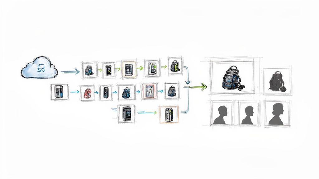
Imagine you’re a fashion brand with 5,000 new arrivals hitting your warehouse. In the old days, getting those products online meant days—or even weeks—of painstaking manual editing. Every single image needed its background removed, colors corrected, and imperfections retouched by hand. It’s slow, it’s expensive, and it’s a recipe for inconsistency.
Now, picture this: you run a single script that connects to an AI API like PixelPanda. Before your team has even finished their morning coffee, all 5,000 of those images have perfectly clean, transparent backgrounds, ready for your website. This is the new reality.
This level of automation creates a rock-solid visual consistency that builds subconscious trust with shoppers. When every product is presented against the same clean backdrop, your entire store just feels more professional and curated.
Upscalinghttps://pixelpanda.ai/free-tools/enhance-photo”>Upscaling Grainy Photos Into Conversion Gold
What about when you’re sourcing products from multiple suppliers? You’re often stuck with whatever low-resolution, poorly lit photos they send you. Those grainy images make your products look cheap and stop customers from zooming in to see the very details that justify a purchase.
This is a classic conversion killer. AI image upscaling is the antidote.
Modern AI models can take a blurry 800×800 pixel image and transform it into a crystal-clear 3200×3200 shot. The AI isn’t just stretching the pixels; it intelligently reconstructs the missing details, sharpening edges and refining textures. The result is a crisp, zoomable image that lets a customer inspect the wood grain on a table or the weave of a fabric. You can experiment with this yourself and see how AI image upscaling works in a live demo to truly grasp the difference.
When a customer can zoom in and see the fine details with perfect clarity, their purchase confidence skyrockets. AI upscaling turns a “maybe” into a definite “add to cart.”
Automating Image Workflows With Code
For developers, integrating this power into your workflow is surprisingly straightforward. Using a simple REST API, you can build these optimizations directly into your content management or inventory system. When a new product is added, your system can automatically fire off the image to the AI for processing and then save the perfected version.
Here’s a conceptual JavaScript snippet showing how you might automate background removal for a newly uploaded product image using an API like PixelPanda:
async function processProductImage(imageUrl, productId) {
const PIXELPANDA_API_KEY = ‘YOUR_API_KEY_HERE’;
const endpoint = ‘PixelPanda Background Remove API‘;
try {
const response = await fetch(endpoint, {
method: ‘POST’,
headers: {
‘Authorization’: Bearer ${PIXELPANDA_API_KEY},
‘Content-Type’: ‘application/json’,
},
body: JSON.stringify({ image_url: imageUrl }),
});
if (!response.ok) {
  throw new Error(`API request failed: ${response.statusText}`);
}

const result = await response.json();
const processedImageUrl = result.data.processed_image_url;

// Now, update your database with the new image URL
updateProductInDB(productId, processedImageUrl);
console.log(`Product ${productId} image updated successfully!`);
} catch (error) {
console.error(‘Failed to process image:’, error);
}
}
// Example usage when a new product is uploaded
const newProductImage = ‘https://example.com/images/new-shirt.jpg‘;
const newProductId = ‘SKU-12345’;
processProductImage(newProductImage, newProductId);
This isn’t just a convenience; it’s a competitive advantage. While your rivals are bogged down in Photoshop, your products are live and selling, all with studio-quality, conversion-driving visuals that were generated automatically in seconds. This is how you get serious about improving ecommerce conversion rates.
Streamlining Your Checkout To Reduce Abandonment
You’ve done it. You’ve successfully guided a curious visitor from a landing page to a product page, wowed them with incredible copy and photos, and they’ve finally hit that glorious “Add to Cart” button. The finish line is just ahead. But hold on—this is where the final boss battle begins, and it’s a doozy.
The checkout process is easily the most critical—and most fragile—part of the entire journey. This is the place where a staggering 70% of all shopping carts are left for dead. Let that sink in. Seven out of ten people who were ready to buy just vanish. The villain here isn’t a change of heart; it’s friction.
Why Your Checkout Is Leaking Money
Every extra click, every confusing form field, and every last-minute surprise fee is a tiny crack in the dam. Once you get a few too many of those cracks, the whole sale just washes away. The biggest mistakes are usually the ones hiding in plain sight, things that seem totally obvious once you look at them through your customer’s eyes.
Forcing someone to create an account before they can hand over their money? That’s the cardinal sin of ecommerce. It’s like a bouncer demanding a full life story before letting you into the shop. All that buying momentum screeches to a halt, and your customer starts wondering if your product is really worth all this trouble.
The Anatomy of a Frictionless Checkout
Designing a checkout that converts isn’t about fancy graphics; it’s about being ruthlessly efficient and earning trust when it matters most. The goal is to make paying you feel like the easiest, most natural thing they’ve done all day.
Here are the non-negotiable elements you absolutely must have:
- Offer Guest Checkout: This is the golden rule. Always, always, always let people check out as a guest. You can nudge them to create an account after their card has been charged, but never, ever make it a barrier to entry.
- Show Progress Clearly: A simple progress indicator—like Shipping > Payment > Confirm—is a game-changer. It tells shoppers exactly where they are and what’s left, which kills the anxiety of a seemingly endless process.
- Keep Forms Minimalist: Only ask for the bare essentials. Do you really need a phone number? Is that “company name” field doing anything for you? Every single field you can slash is a tiny win for improving ecommerce conversion rates.
A customer in your checkout is on a mission. Don’t throw pop-ups at them, don’t overwhelm them with options, and for the love of all that is holy, don’t surprise them with hidden fees. Just get out of their way and let them pay you.
Building Trust When It Matters Most
The moment a customer reaches for their wallet, their spidey-senses are tingling. They’re on high alert for anything that looks sketchy. This is your chance to show them they’re in good hands.
Placing trust badges and security seals right where they can see them is a classic for a reason. Little icons for SSL security, Visa, Mastercard, and PayPal provide instant reassurance right next to the payment fields. It’s a simple psychological cue that says, “Don’t worry, we’re legit and your data is safe.”
On that note, giving people multiple ways to pay is no longer a “nice-to-have.” Some folks swear by Apple Pay, while others won’t complete a purchase without a PayPal option. When you include these familiar, one-click methods, you not only make life easier but also borrow the credibility and security that come with those big-name brands. If you want to dive deeper into payment processing, the folks at payments-experts have some great resources.
At the end of the day, a streamlined checkout is all about respecting your customer’s time. By removing hurdles, being upfront about costs, and signaling that their security is a priority, you can transform the most dangerous part of your funnel into a smooth, satisfying finale.
Adopting A Culture Of Continuous Optimization
So, you’ve plugged the big leaks and optimized the obvious stuff. Now what? The real magic in e-commerce isn’t about one-and-done fixes; it’s about building a machine that constantly gets smarter. This is where you shift from one-off projects to a marathon of smart, consistent improvements.
Think of yourself as a data-driven detective for your own store. You’re always on the lookout for clues, testing new theories, and tweaking things to make the experience just a little bit better, every single week. It’s about creating a feedback loop—test, learn, and iterate—that turns guesswork into a system of informed decisions that fatten your bottom line.
Demystifying The A/B Test
The engine driving this whole process is the A/B test, also known as split testing. It sounds way more complicated than it is. At its core, it’s just showing two different versions of a page to your visitors to see which one gets you more of what you want.
Version A is your current page, the “control.” Version B is the new contender, with one—and only one—change. This is the “variant.”
The secret sauce is asking a specific, measurable question. Don’t ask, “Will a new button color work better?” That’s a shot in the dark. Instead, ask something like, “Will changing our ‘Buy Now’ button from blue to orange increase add-to-carts by 5% on our top-selling product page?” See the difference? That second one gives you a clear target and a metric to measure.
Your First Simple Test
You don’t need a Ph.D. in statistics to get started. Many platforms like Shopify have A/B testing features baked right in, and free tools like Google Optimize are incredibly powerful for running experiments.
Here’s how you could launch a simple test today:
- Create a Hypothesis: “I believe that adding a short, 30-second product video above the description will boost the add-to-cart rate because it shows the product in action, making its value instantly obvious.”
- Build the Variant: Just duplicate your product page and pop in the video. That’s your Version B.
- Run the Test: Use your tool of choice to split your traffic 50/50 between the original page (A) and the new page with the video (B).
- Check the Results: Let the test run until it has enough data to be meaningful. Most tools will even tell you when it’s reached “statistical significance.” Did the video page win?
If the answer is yes, fantastic! You’ve found a winner. Roll out that change for everyone and start thinking about your next hypothesis. As you get more advanced, it’s worth diving into established conversion rate optimization best practices to get more ideas.
Never Stop Asking “Why?”
This is the most crucial part. You have to stay curious. Every single test, whether it’s a massive win or a total flop, teaches you something important about your customers.
If a test fails miserably, don’t just scrap it and move on. Ask why. Was the video too slow to load? Did it feel out of place? Was the thumbnail unappealing? This kind of thinking turns every outcome, good or bad, into a priceless learning opportunity.
The journey from a customer landing on your site to making a purchase is full of potential drop-off points, as this flow shows.
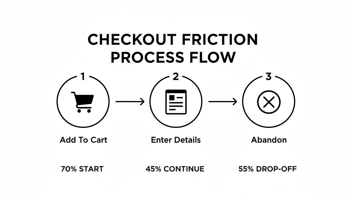
Every single step is a chance to lose someone. That’s precisely why continuous testing, even on the tiniest details, is so critical for improving ecommerce conversion rates. Your job is to make each little step smoother than the last.
Got Questions About CRO? We’ve Got Answers
Stepping into the world of conversion rate optimization can feel a bit overwhelming. You fix one thing, and three new questions pop up. It’s totally normal. Let’s cut through the noise and tackle some of the most common questions I hear from store owners.
What’s A “Good” Ecommerce Conversion Rate, Anyway?
Ah, the million-dollar question. The honest, non-annoying answer is: it really, truly depends.
Sure, you’ll see stats throwing around a global average of 1.9%. But a “good” rate is all about your context. A niche shop selling limited-edition sneakers might hit 4%, while a business selling high-end, custom-built PCs could be popping champagne over a 1% conversion rate.
Instead of getting hung up on industry benchmarks, focus on outperforming yourself. If you converted at 1.5% last quarter, aim for 1.7% this one. That’s the real game. This shift in thinking puts the spotlight on your own progress, which is the whole point of improving your store’s conversions.
Your real competitor isn’t the store down the street; it’s your store from last month. Chase those small, steady wins. They add up to massive momentum.
Seriously, How Much Do AI-Enhanced Images Affect Sales?
More than you’d think. It’s not just about making things “look pretty.” AI image tools directly boost sales by erasing doubt from the customer’s mind. When a shopper can see the fine stitching on a leather bag or the exact shade of a lipstick, their confidence to click “buy” goes through the roof.
Here’s how AI gets it done:
- Pro-Level Quality, Instantly: Got blurry photos from a supplier? AI upscaling can sharpen them into crisp, high-res shots that look incredible on a 4K monitor or a tiny phone screen.
- A Cohesive Look: Automated background removal ensures every product has the same clean, consistent backdrop. This makes your whole brand feel more polished and trustworthy.
- Zoom Without Doom: Smart enhancement lets shoppers zoom in and see the details without hitting a wall of fuzzy pixels. For mobile shoppers, this isn’t a luxury; it’s a necessity.
Better images build trust, which leads to more add-to-carts. It also means fewer returns, because what customers see is exactly what they get.
I Need A Quick Win. Where Do I Start Optimizing?
Easy. Go straight for the low-hanging fruit: your top 5-10 most visited product pages. These pages are already getting eyeballs, so any improvement you make here will have an immediate, amplified effect on your revenue.
Don’t boil the ocean. Pick just one of those pages and run a simple test. Pit your current images against a set that’s been enhanced by AI. This one focused tweak can often deliver a noticeable bump in conversions, giving you a quick win and the motivation to keep going. It’s the classic 80/20 rule in action.
Besides Bad Images, What’s The Biggest Thing That Kills Sales?
Oh, this one’s a classic. Hands down, it’s the last-minute surprise costs that pop up during checkout.
Imagine this: a customer finds a product they love, they’ve agreed to the price in their head, and they’re ready to buy. Then, on the very last screen, a massive shipping fee or an unexpected tax calculation appears out of nowhere. It feels like a bait-and-switch, and it shatters the trust you just spent all that time building.
Be radically transparent with your costs from the get-go. Better yet, offer free or flat-rate shipping. It’s one of the single most powerful ways to stop shoppers from ditching their carts at the finish line.
Ready to stop letting so-so images cost you sales? PixelPanda uses AI to create stunning, high-converting product photos at scale. You can automate background removal, sharpen grainy pictures, and get a perfectly consistent look across your entire store in seconds. Start your free trial at PixelPanda and see what a difference great visuals make.