Your product photos can make or break your online sales. When customers shop online, they rely on images to make buying decisions. Clear, consistent, and professional images build trust, improve brand recognition, and boost revenue. Here’s why a photography style guide is essential:
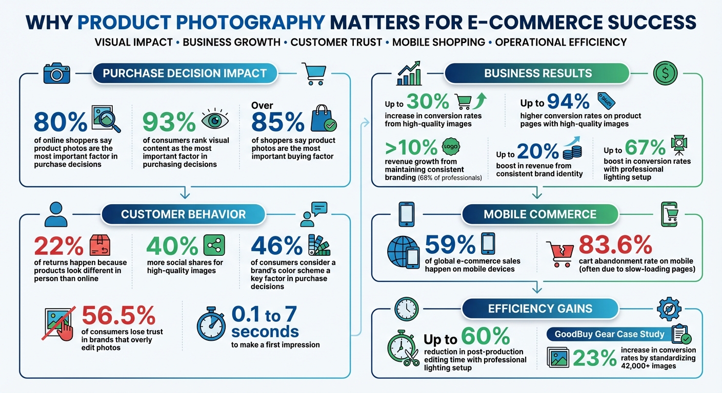
- Consistency builds trust: 80% of online shoppers say product photos are the most important factor in their purchase decision.
- Reduce returns: 22% of returns happen because products look different in person than online.
- Boost engagement and sales: High-quality images get 40% more social shares and can increase conversion rates by up to 30%.
A style guide ensures every image aligns with your brand by standardizing lighting, angles, colors, and editing. It saves time, simplifies workflows, and helps your team deliver polished visuals across platforms like Amazon, Shopify, and social media. Whether you’re shooting with soft lighting, selecting focal lengths, or editing for color accuracy, these guidelines ensure your photos stand out and drive results.
Ready to elevate your product photography? Read on for actionable tips to create a style guide that works.
E-commerce Product Photography Impact Statistics and Best Practices
ecommerce-product-photography-or-lighting-styling-tools-and-solutions” tabindex=”-1″ class=”sb h2-sbb-cls”>6 Pro Tips to SUCCEED in Ecommerce Product Photography | Lighting, Styling, Tools & Solutions
sbb-itb-76ad1b7
Define Your Brand’s Visual Style
Your product photos should have a consistent look that makes your brand instantly recognizable – even before your logo appears. Nearly 46% of consumers consider a brand’s color scheme a key factor when deciding on a purchase. Additionally, 68% of professionals say maintaining consistent branding contributes to more than 10% of their revenue growth.
Start by identifying your brand’s personality – whether it’s bold and energetic or calm and refined – and let that guide every visual decision. From colors to camera settings, every choice should reflect this identity. For example, an activewear brand might lean into vibrant colors and tight framing, while a luxury skincare brand could opt for muted tones and soft focus. Establish these foundational visual elements before diving into specifics like lighting, lens selection, and ai tools for image editing.
Set Your Brand’s Color Palette
Converting your brand’s personality into visuals begins with a clear color palette. Colors evoke emotions and influence how customers perceive your brand. For instance:
- Blue suggests trust and reliability, making it a go-to for tech brands.
- Red communicates passion and urgency, fitting for youthful or creative businesses.
- Green symbolizes health and eco-consciousness, perfect for sustainable products.
Your chosen colors should appear consistently – not just in your products but also in backgrounds, props, and even lighting. Document these colors in RGB, HEX, and Pantone formats to ensure uniformity across all platforms. For example, if your brand uses coral, decide whether it should appear as a vibrant, saturated hue for a playful vibe or a softer tone for a more natural look. Some brands strategically reserve intense saturation for specific colors to make their visuals pop.
For primary product listings, platforms like Amazon, eBay, and Google Shopping often require white backgrounds. White not only ensures accurate color representation but also creates a clean, cohesive layout. Use colored backgrounds sparingly for lifestyle shots, promotional images, or social media posts where you want to evoke a specific mood.
Select Your Focal Lengths and Depth of Field
Your lens choice directly impacts how your products are perceived. A 50mm focal length replicates natural human vision, offering a balanced and realistic perspective. For high-end products, an 85mm prime lens provides exceptional sharpness with minimal distortion, giving your photos a polished, premium feel.
Depth of field – how much of your image is in focus – also plays a role in shaping your brand’s visual identity. A shallow depth of field, where the background is blurred, highlights intricate details like fabric textures or jewelry craftsmanship. This approach builds trust by emphasizing material quality. On the other hand, a deeper focus works well for lifestyle shots that showcase your product in context. Ioanna Nella, Growth Manager at Pixofix, sums it up perfectly:
"Visual consistency across channels makes your brand recognizable, even in a sea of competition".
Using inconsistent focal lengths across your catalog can result in a disjointed, "collage-like" appearance on your website. Stick to prime lenses instead of zoom lenses to maintain consistent sharpness and perspective throughout your product photography.
Create Lighting Standards
Lighting plays a crucial role in professional product photography. Over 85% of shoppers say product photos are the most important factor in their buying decisions, and first impressions are made in as little as 0.1 to 7 seconds. Poor or inconsistent lighting can make your brand seem unreliable, which can hurt trust and sales.
Using studio lighting is the best way to ensure consistency because it isn’t affected by weather or time of day. A three-point lighting setup works well: a key light as the main source, a fill light at 50–75% intensity to soften shadows, and a backlight to separate the product from the background.
For example, in 2025, the secondhand marketplace GoodBuy Gear standardized over 42,000 product images using AI tools for photo editing. This effort led to a 23% increase in conversion rates. This example demonstrates how proper lighting can directly improve your sales performance. By following studio lighting principles, you can create soft, even illumination that highlights your products beautifully.
Use Soft and Even Lighting
Harsh, direct lighting creates strong shadows that obscure details and make textures appear less appealing. Soft lighting, on the other hand, spreads evenly, showcasing your product’s true shape and quality. To achieve this, position large light sources, like softboxes or windows, close to your product for subtle, flattering shadows.
Use tools like diffusers and reflectors to soften shadows and distribute light evenly. For even better results, try double diffusion by using softboxes with both internal and external diffusion panels. A seamless background – created by curving a white backdrop from the wall down to the shooting surface (a technique called a "sweep") – eliminates harsh horizon lines for a clean, polished look. If you’re using studio lights, block out external light sources like windows to avoid mismatched color temperatures or exposure shifts. For reflective or glossy items, position larger light sources at a 30–40° angle to redirect reflections away from the camera lens. Also, keep a distance of 3–4 feet between the light source and the product for optimal results. A professional lighting setup can cut down post-production editing time by as much as 60%.
Once you’ve established soft, even lighting, focus on keeping the color temperature consistent to solidify your brand’s visual identity.
Maintain Consistent Color Temperature
Color temperature affects whether your lighting looks warm (yellowish) or cool (bluish). Inconsistent color temperatures can make the same product look different across photos, which erodes customer confidence. Since over 75% of online shoppers prioritize product images when making purchase decisions, accurately representing colors is critical.
After setting up soft lighting, ensure your color temperatures are uniform. Use 5600K daylight-balanced lighting for neutral, true-to-life colors. Manually set your camera’s white balance and start each session by using a gray card for calibration. Choose bulbs or flashes labeled as "photographic-specific tint lights" to avoid unwanted color casts, like blue, green, or orange hues. If you’re using multiple light sources, ensure they all have the same color temperature – mixing different types can create clashing tones that are difficult to fix in editing. Avoid combining natural window light with warm indoor bulbs, as this will result in mismatched color temperatures.
LED lights are a great option because they’re energy-efficient, produce minimal heat, and offer consistent color output. Many LED systems come with dimmers and adjustable temperature controls, giving you more flexibility in your setup. Steer clear of fluorescent lights, which can introduce unwanted green or blue tones, and tungsten lights, which generate excessive heat and inconsistent colors when adjusted.
"Our biggest problem during packshot shoots was the lighting, which was never the same in all the photos." – Endro Cosmétiques
Investing in a reliable studio lighting setup can boost conversion rates by up to 67%. Additionally, product pages with high-quality images see up to a 94% higher conversion rate. To maintain consistency, document your lighting setup – including light positions, distances, power levels, and color temperature – so you can replicate it for every shoot.
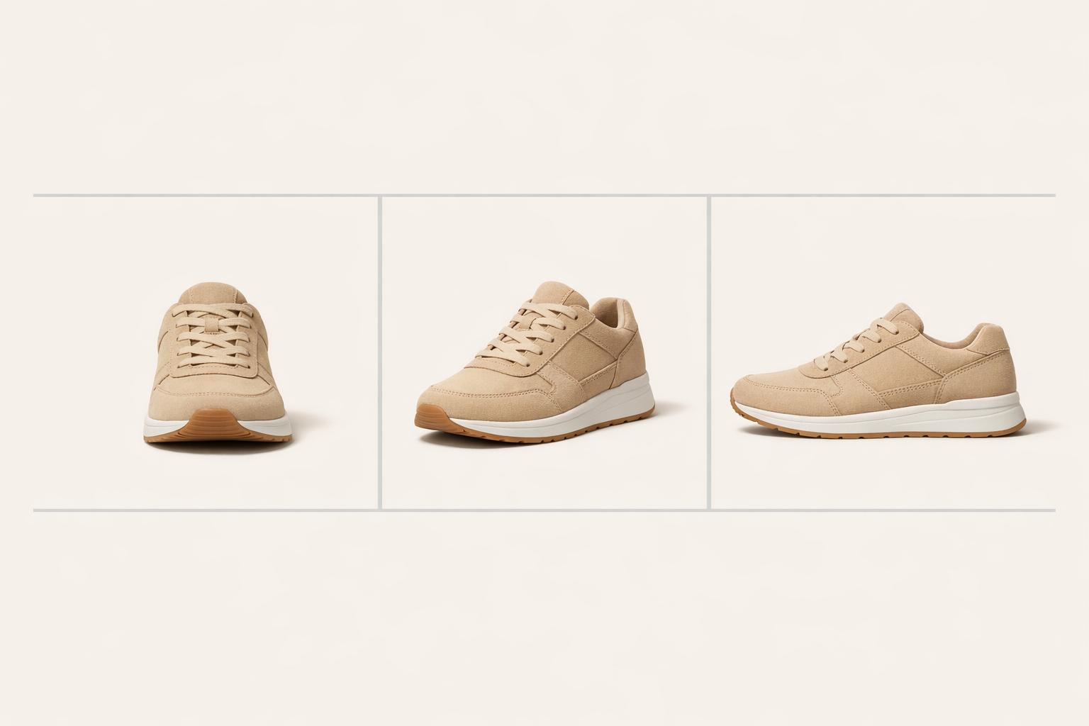
Set Standards for Product Angles and Composition
Once you’ve nailed down your lighting standards, it’s time to focus on angles and composition. These elements are essential for showcasing your products effectively. Clear angles reveal important details, helping shoppers make confident decisions, while consistent composition ensures your catalog looks polished and unified.
Start by creating a shot list that outlines the key angles for each product category. At a minimum, include the following:
- Front angle (eye-level): Highlights the main features of the product.
- 45-degree angle: Adds depth and displays multiple sides at once.
- Back angle: Reveals details like closures, buttons, or other back-facing features.
- Macro shots: Ideal for products like apparel, jewelry, or tech where texture or intricate details matter.
Make sure the product fills at least 85% of the frame, following Amazon’s guidelines. This tight, centered framing is especially important for main listing images. These standards build a framework for photos that inspire trust and provide clarity.
"Angles matter in product photography. They expose details, helping shoppers make informed decisions." – Carolyn Mara, Photographer
To maintain consistency, use a tripod to lock in angles and ensure sharp focus, even when photographing large batches. Mark the floor with tape to guide the exact positioning of both the tripod and the product. When shooting front and back angles, keep the camera fixed and rotate the product instead – this ensures uniform framing across all shots. Consistent angles not only make your catalog visually cohesive but also reinforce your brand’s identity.
Include These Key Angles
Different products benefit from specific angles, so it’s important to tailor your approach. For example:
- Shoes and bags: Profile (side) shots showcase their shape and dimensions.
- Books, jewelry, and food: A top-down (bird’s-eye view) angle highlights layout and design.
- Size-sensitive items: Include a scale reference, such as a hand, coin, or everyday object, to communicate proportions clearly.
Lifestyle shots are another powerful tool. By showing the product in a real-life setting, you help customers visualize how it fits into their daily routines. For bottled or jarred goods, center the label with equal spacing on both sides for a balanced look. Reflective items like jewelry can be tricky – use folded white cards around the product to minimize harsh reflections and ensure accurate color capture.
| Angle Type | Best Use Case | Primary Benefit |
|---|---|---|
| Front | Main listing image | Displays primary features and design |
| 45-Degree | 3D products (bags, shoes) | Adds depth and shows multiple sides |
| Macro | Jewelry, apparel, tech | Highlights texture, quality, and details |
| Top/Flat Lay | Books, food, accessories | Shows shape and layout |
| Lifestyle | Marketing/Social media | Demonstrates scale and provides context |
These angles work together to create a consistent and professional photography strategy.
Apply Basic Composition Rules
For standard e-commerce photos, center the product to keep the focus entirely on the item. For more creative shots, like those used on social media or website banners, try the rule of thirds. Imagine your frame as a tic-tac-toe grid and position the product at one of the intersections. This creates a visually appealing focal point and leaves room for text or other design elements.
"If you’re going for eCommerce photography… you want the product to be centered in the photo. If you are doing something more stylized… you can get a little bit more creative and do like rule of thirds." – Danni Siminerio, Manager, Square Photo Studio
For product groupings, the rule of odds works well – arrange items in sets of three or five to naturally draw the viewer’s eye. When shooting at eye level, create depth by arranging objects diagonally, with the tallest items in the back. For flat-lay photography, experiment with a "C" composition by placing items and props in a crescent shape, leaving the center clear. Lastly, use a high f-stop (like f/8 or above) to achieve a wide depth of field, ensuring the entire product stays in crisp focus.
Set Background and Styling Guidelines
Your background and props are just as crucial as lighting and composition when it comes to defining your brand’s visual identity. These elements influence how customers view your products and help maintain consistency across your catalog. A cohesive approach builds trust while keeping the spotlight firmly on your items.
Use Simple Backgrounds
Plain white backgrounds are the go-to choice for platforms like Amazon, Walmart, and eBay. They eliminate distractions, ensuring the product remains the focal point. Claire Oswald, Product Marketing Manager at soona, emphasizes this point:
"Product images on white backgrounds create a sense of simplicity and elegance. The absence of distractions allows your customers to focus solely on the product itself".
To achieve a professional white background, try the "sweep" technique. This method uses a seamless curve from the wall to the floor, removing horizon lines and delivering a polished look. Aim to leave 10–15% white space around the product for balance. If your brand embraces a lifestyle or eco-friendly vibe, consider neutral tones like beige, cream, or nude. These softer hues provide a modern, stylish feel while keeping the product at the center of attention.
For lifestyle photos, contextual backgrounds can work wonders. Showing a product in its natural setting – like a toothbrush in a bathroom or a mug on a kitchen counter – offers practical context and helps customers imagine how they’d use the item.
Once your background is set, props can add depth and context, but they need to be used thoughtfully.
Add Props Carefully
Props can elevate your product images by providing context and scale, but moderation is key. Choose items that naturally complement your product. For instance, pair a skincare product with a bath poof or towel, or place citrus slices beside a refreshing summer drink.
When arranging props, be mindful of shadows. Items placed too close to the light source can cast distracting shadows that obscure key product details. For flat-lay shots, try a "C" composition to guide the viewer’s eye, while for eye-level shots, arrange props diagonally, with taller items in the back and shorter ones in the front to create depth.
The goal is to enhance the product, not overshadow it. Camille Ouellette, Owner of Camillette, highlights the importance of relatable imagery:
"You also need photography on people so people can really relate and see, ‘It’s going to look like this on me’".
Set Editing and Post-Production Standards
Consistent post-production is just as important as standardized shooting techniques when it comes to reinforcing your visual brand. Even perfectly shot images can feel mismatched if the editing process isn’t consistent. Start with the basics: exposure, contrast, and white balance. These adjustments ensure your images align visually and that colors reflect the actual product. This is especially critical in e-commerce – imagine a dress that appears green online but turns out to be blue in person. That mismatch leads to returns and damages customer trust.
Make sure to use the sRGB color profile for all web images. This ensures your products look consistent across different devices and browsers. Clean up any dust, fingerprints, or scratches using tools like spot healing and clone stamping, but don’t go overboard. Over-retouching can backfire – 56.5% of consumers say they lose trust in brands that overly edit their photos. Keep edits minimal to maintain authenticity.
For large catalogs, batch processing can be a lifesaver. Tools like Lightroom presets or Photoshop actions allow you to automate repetitive tasks like resizing, color correction, and sharpening, saving time while maintaining a uniform look. Take inspiration from GoodBuy Gear, which, in November 2025, standardized imagery for over 42,000 products using AI-powered batch editing. This move led to a 23% boost in conversion rates, thanks to consistent backgrounds and automated lighting corrections.
Apply Color Correction and Retouching
Automated batch processing gets you partway there, but fine-tuning each image takes your visuals to the next level. Focus on precise adjustments to exposure, contrast, and white balance to eliminate color casts and bring out the texture of the product. For example, use white balance to neutralize unwanted hues – like yellow tones from tungsten lighting or blue tints from daylight – so whites appear crisp and clean. Be cautious with saturation: while it can make colors pop, overdoing it makes products look unnatural, which can increase return rates.
When working with apparel, frequency separation is a handy technique. It helps smooth out imperfections while keeping the fabric’s natural texture intact. Adding realistic drop shadows or reflective shadows can also make your products look grounded and three-dimensional, avoiding that awkward "floating" effect often seen with white backgrounds. Consistently applying filters across your product images ties everything together visually, creating a cohesive look that strengthens brand recognition. As Alexandra Sheehan from Shopify points out, maintaining brand consistency can boost revenue by up to 20%.
Use PixelPanda for Faster Editing

Once you’ve nailed your manual editing workflow, tools like PixelPanda can help you scale up while keeping everything consistent. PixelPanda’s AI-powered features streamline tasks like background removalixelpanda.ai/free-tools/background-remover”>background removal, image upscalinghttps://pixelpanda.ai/free-tools/enhance-photo”>upscaling, and batch editing, ensuring high-quality results across your entire catalog.
The background removal tool creates clean, distraction-free images that meet marketplace standards for platforms like Amazon and eBay. Meanwhile, image upscaling enhances quality, delivering sharper finishes that allow customers to zoom in and inspect product details.
PixelPanda’s batch editing feature is a game-changer for managing large volumes of content. It applies uniform adjustments – like color correction, cropping, and style tweaks – across thousands of images at once. For studios producing over 5,000 assets monthly, automation ensures every image aligns with your brand’s visual guidelines. Additionally, PixelPanda offers AI-generated product photos and customizable models featuring diverse body types and ethnicities, allowing brands to create localized, inclusive content while sticking to their branding.
| Feature | Benefit for E-commerce |
|---|---|
| Background Removal | Creates distraction-free images that meet marketplace standards |
| Image Upscaling | Produces sharper visuals, enabling customers to zoom in on details |
| Batch Editing | Ensures consistent color, cropping, and style across large catalogs |
| Color Correction | Delivers accurate product representation, reducing returns |
Optimize Images for Different Devices and Platforms
Once your images are consistently edited, the next step is ensuring they perform well across all devices and platforms. Since 59% of global e-commerce sales happen on mobile devices, your images must load properly whether viewed on a smartphone, tablet, or desktop. But here’s the tricky part: you need to balance high-quality visuals with fast loading speeds. This is especially critical because mobile users abandon carts at an alarming 83.6% rate, often due to slow-loading pages.
Different e-commerce platforms have specific image requirements, and failing to meet them can hurt visibility and sales. For instance, Amazon mandates a pure white background with products filling 85% to 100% of the frame, while Etsy encourages lifestyle photography alongside standard product shots. Meeting these platform-specific guidelines ensures your images display correctly and leverage features like zoom functionality, which typically requires images to be at least 1,000 to 2,000 pixels on the longest side.
Select the Right Image Dimensions and Formats
Technical specifications are just as important as editing consistency to ensure your images perform well across platforms. A good rule of thumb? Standardize your master product images to 2,048 x 2,048 pixels. This size is compatible with major platforms like Amazon, Shopify, and Etsy while enabling zoom functionality for detailed product views. As product photographer Tom Crowl explains:
"Too large an image will be compressed, which can cause it to look blurry. Too small an image will be enlarged and look pixelated. Both looks will cost you sales".
When it comes to file formats, JPEG is ideal for standard product photos. Save JPEGs at 85% quality to strike a balance between clarity and file size. If transparency is needed, go with PNG. For smaller file sizes without sacrificing quality, consider WebP, which can shrink files by over 30% compared to JPEG. If you’re looking for even more compression, AVIF produces files about 50% smaller than JPEGs, though it requires more processing power. Always use the sRGB color space to ensure consistent colors across devices.
| Platform | Recommended Dimensions | Min for Zoom | Max File Size | Supported Formats |
|---|---|---|---|---|
| Amazon | 2,000 x 2,000 px | 1,000 px | 10 MB | JPEG, TIFF, PNG, GIF |
| Shopify | 2,048 x 2,048 px | 800 px | 20 MB | JPEG, PNG, WebP, GIF, TIFF, BMP |
| Etsy | 2,000 x 2,000 px | 1,000 px | 20 MB | JPEG, PNG, GIF, WebP |
| eBay | 1,600 x 1,600 px | 800 px | 12 MB | JPEG, PNG, WebP, TIFF, HEIC, AVIF |
| Walmart | 2,000 x 2,000 px | 2,000 px | 2 MB | JPEG, PNG, BMP |
Optimize for Mobile Screens and Fast Loading
To cater to mobile users, your images need to be lightweight and appropriately sized for different screen resolutions. Create multiple versions of each image: one at 2,048 pixels for zoom functionality, another at 1,024 pixels for desktop viewing, and a smaller version at 512 pixels for mobile screens. For mobile hero images, aim for a maximum file size of 150KB, while thumbnails should be around 50KB.
Stick to square (1:1) or vertical (3:4) aspect ratios to display more detail on mobile without forcing users to scroll excessively. To improve loading speed and user experience, add width and height attributes to your HTML to prevent Cumulative Layout Shift (CLS), which can disrupt page layouts. Use lazy loading for images below the fold, prioritizing hero images to speed up the initial load time. As Michael Keenan from Shopify puts it:
"Today, more people browse the internet on mobile devices than on desktop computers. With a variety of screen sizes in use, you need to choose the best image sizes… so that all your visitors have a good user experience".
For further optimization, remove unnecessary metadata during export to reduce file size. Using a Content Delivery Network (CDN) can also help by serving images from servers closer to your customers, cutting down on latency. These small adjustments can make a big impact – especially when a single large, unoptimized image can take up to 4.1 seconds to load on a website server.
Conclusion
A photography style guide isn’t just a nice-to-have – it’s a powerful tool for creating a consistent visual identity that builds trust and drives sales. By defining elements like your color palette, lighting, composition, and editing standards, you give your team a clear roadmap to follow. And the results? High-quality product photography can increase conversion rates by as much as 30%, with 93% of consumers ranking visual content as the most important factor in their purchasing decisions.
To make your style guide truly effective, it needs to be actionable. Include specific technical details like focal lengths, approved angles, and color temperatures. Add a "don’ts" section with examples of what to avoid, and provide presets for tools like Adobe Lightroom or Photoshop to ensure consistent color tones across all shoots. Every detail, no matter how small, contributes to the bigger picture.
Automated tools such as PixelPanda can also play a significant role. These tools streamline processes like background removal, color correction, and image upscaling, saving you hours of manual editing. With just a few clicks, you can apply consistent adjustments across an entire product catalog, ensuring a polished and professional look every time.
Don’t forget to review your style guide regularly – quarterly updates can help you stay aligned with shifting trends and performance metrics. Whether it’s the growing interest in authentic, lo-fi content or the rise of immersive 360° product views, your guide should adapt to keep your brand fresh and recognizable across all platforms, from your website to social media and marketplace listings.
Start today. A well-implemented style guide can transform your visual strategy, creating consistency that elevates your brand and boosts your e-commerce success.
FAQs
How does a photography style guide help reduce product returns?
A photography style guide plays a key role in ensuring your product images are consistent, accurate, and visually appealing. When customers see high-quality, realistic photos that align with the product they receive, it strengthens their trust in your brand and reduces confusion about details like size, color, or features.
By setting clear standards for lighting, angles, and editing, a style guide allows you to present your products in the best way possible while staying true to their actual look. This reduces unexpected surprises for customers, ultimately helping to lower return rates and saving both time and money.
What is the best focal length for product photography?
When selecting a focal length for product photography, aim for one that reduces distortion and showcases your product’s details clearly. A good starting point is a focal length between 50-100mm on a full-frame camera or 35-60mm on a cropped-sensor camera. This range delivers a natural perspective, ensuring your product appears balanced and visually pleasing.
Sticking to these focal lengths helps you avoid the exaggerated distortion often caused by wide-angle lenses. It also allows you to capture sharp, detailed images that highlight textures and features effectively. By experimenting within this range, you can find the ideal angle to make your product photos look polished and professional, helping them grab attention and boost online sales.
Why is proper lighting important for e-commerce product photos?
Lighting plays a crucial role in how customers perceive your products online. Proper lighting ensures that colors appear true to life, details are sharp, and shadows or reflections are well-controlled. When your product photos are well-lit, they highlight your items in the best possible way. On the flip side, poor lighting can distort how products look, leading to misrepresentation – and that often results in frustrated customers, more returns, and lower satisfaction.
To capture high-quality images, consider using tools like continuous LED lights or strobes. Pair these with techniques like light diffusion to soften harsh shadows and bring out textures in your products. Consistent, professional lighting doesn’t just make your products look better; it also builds trust with customers. And trust? It’s key to driving sales and keeping returns to a minimum.