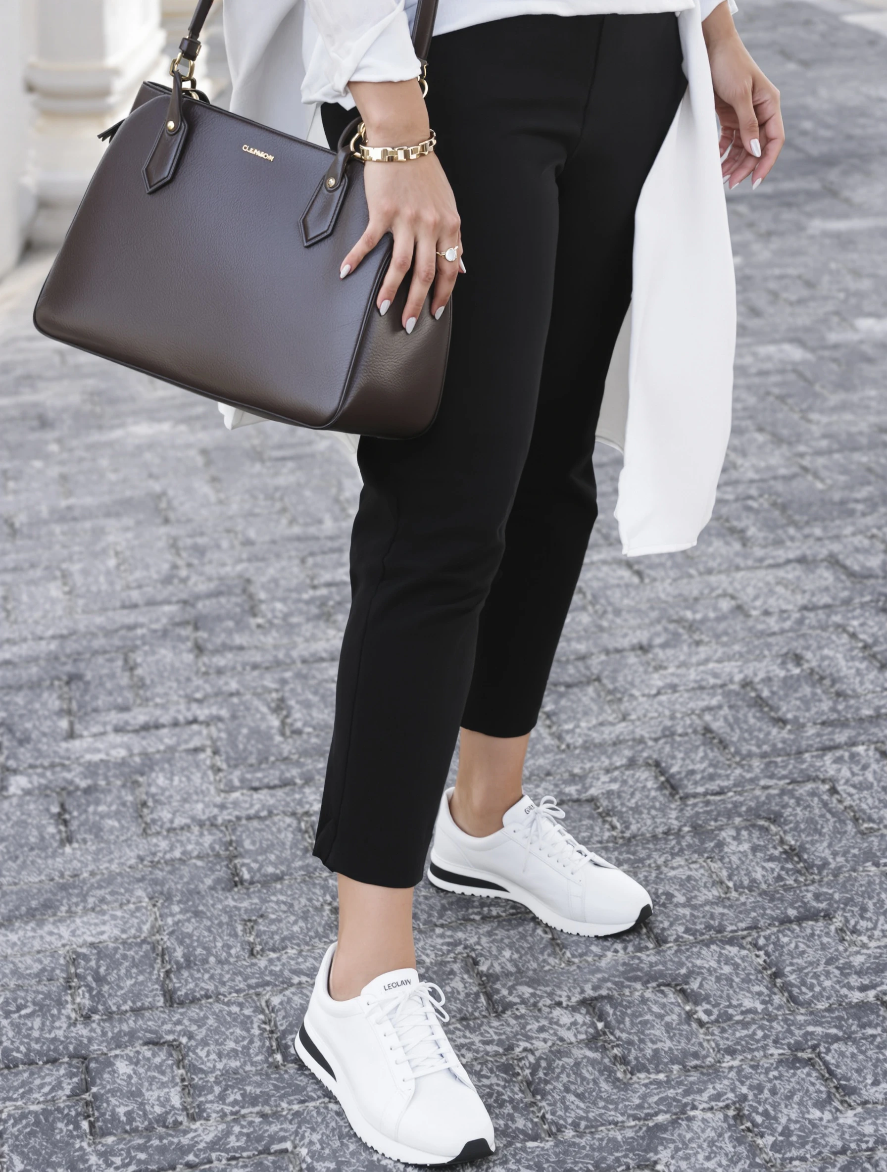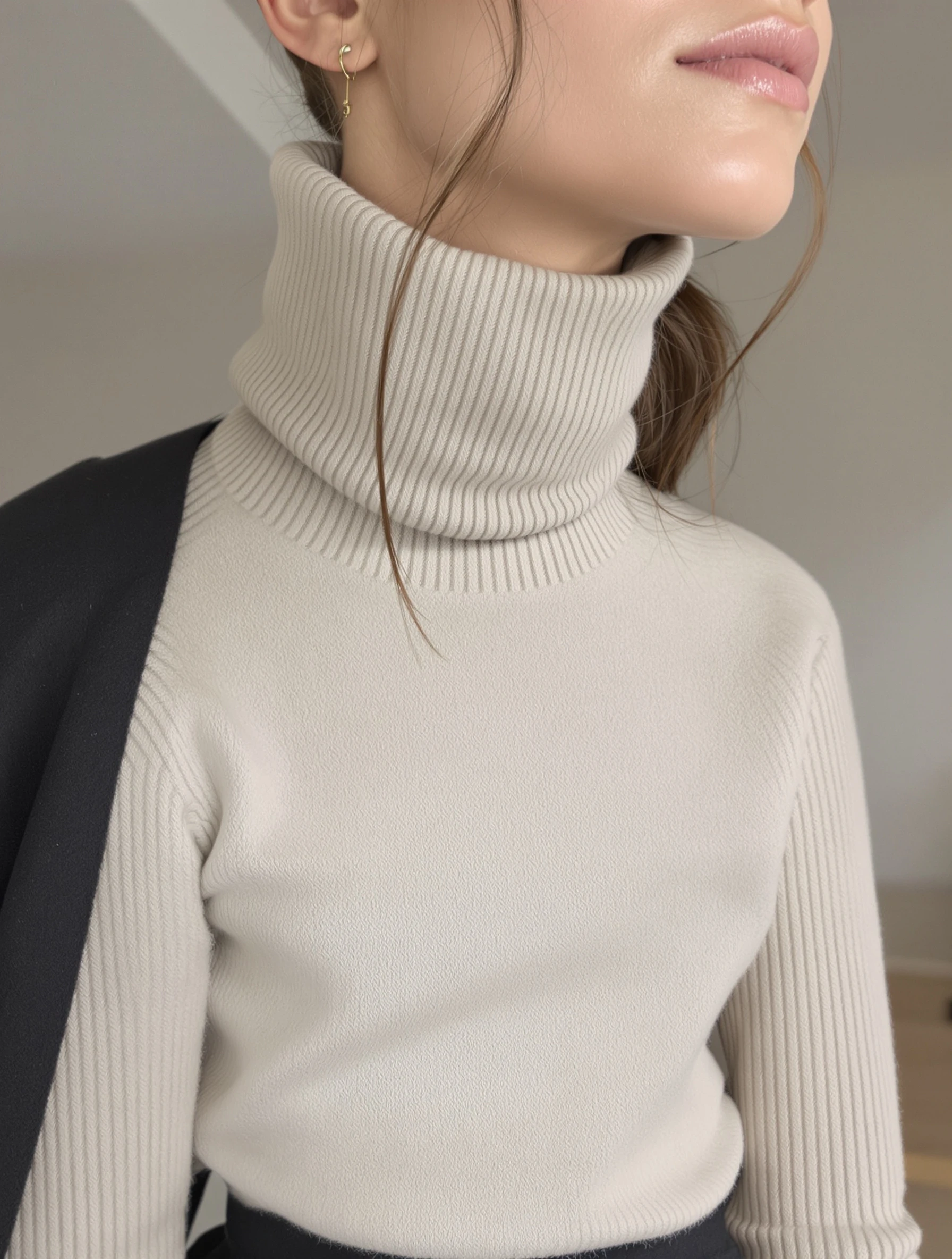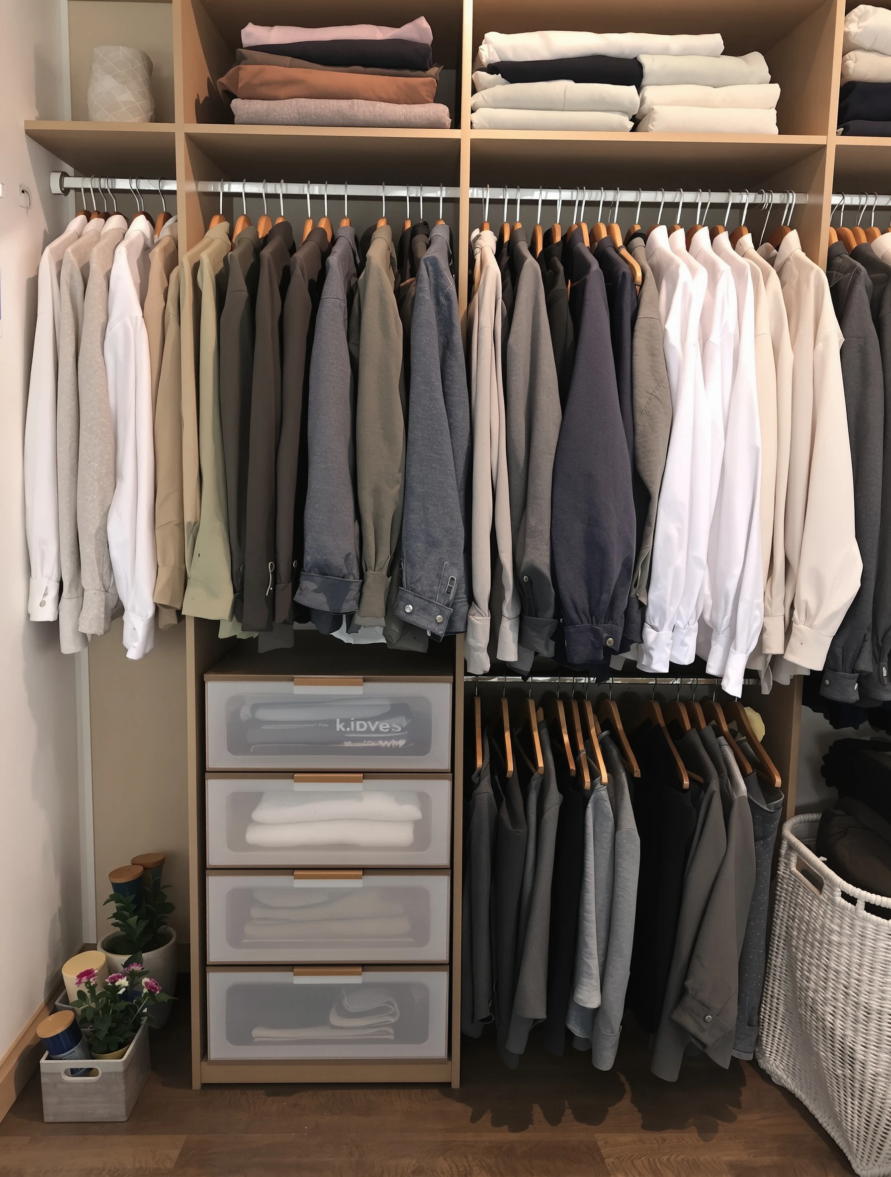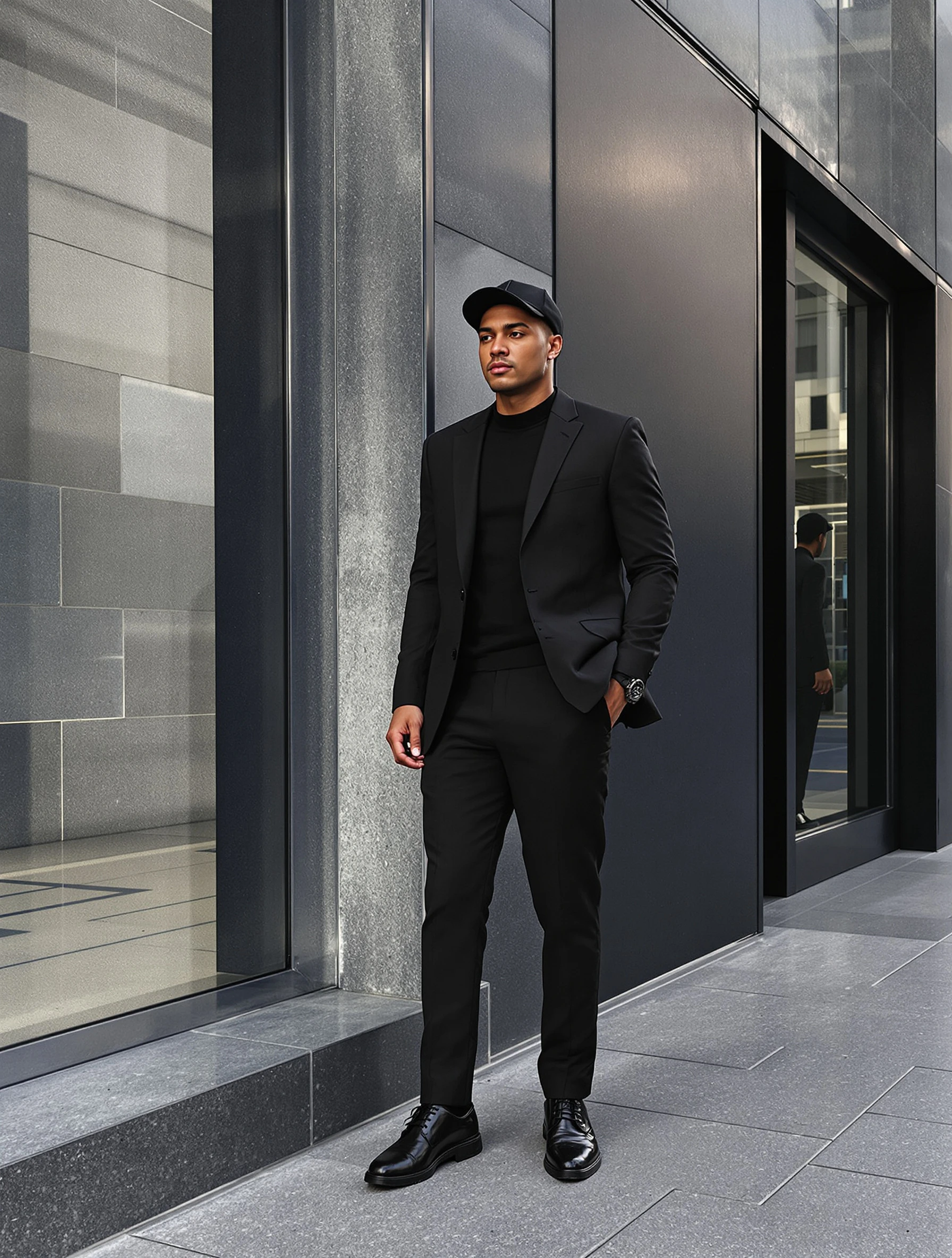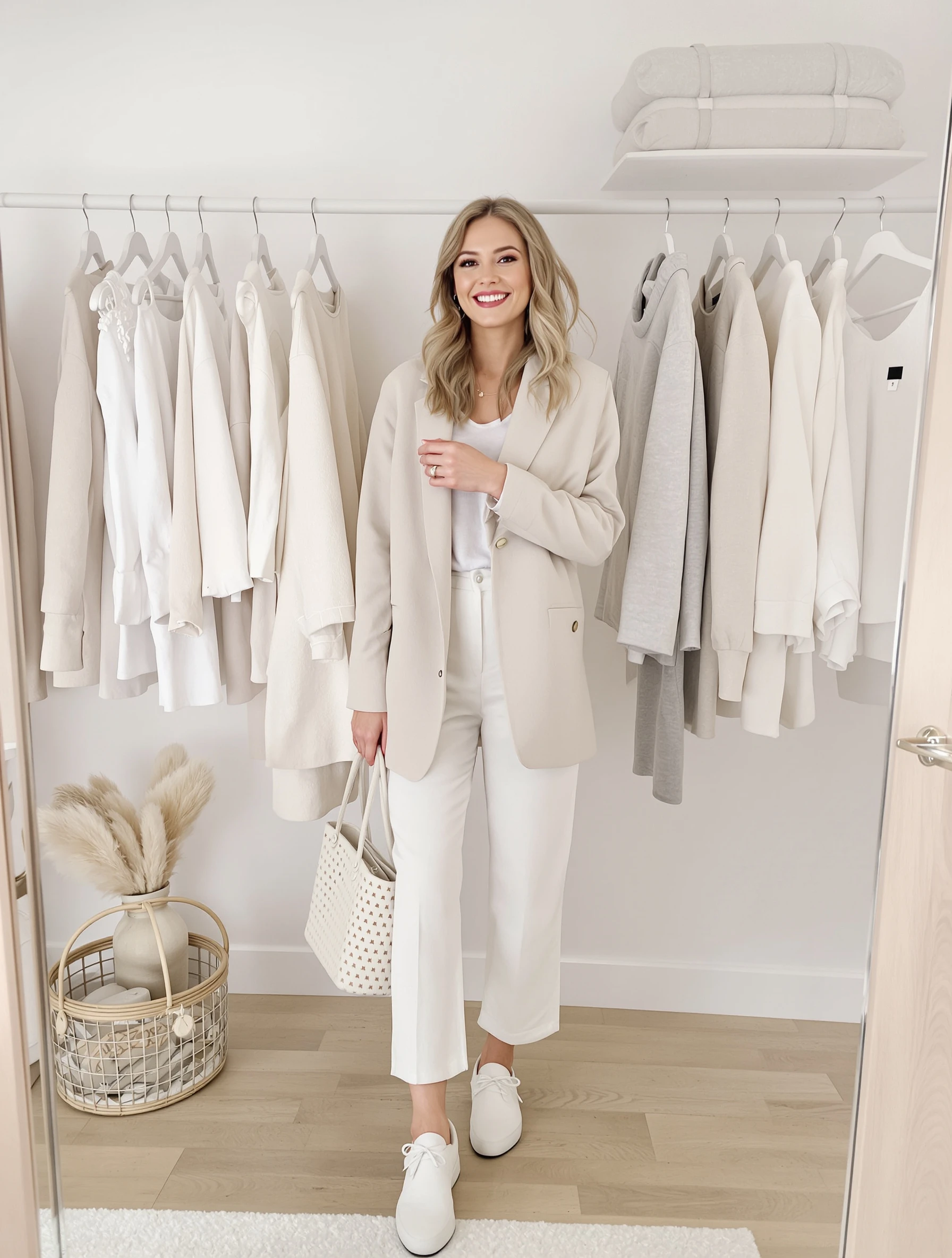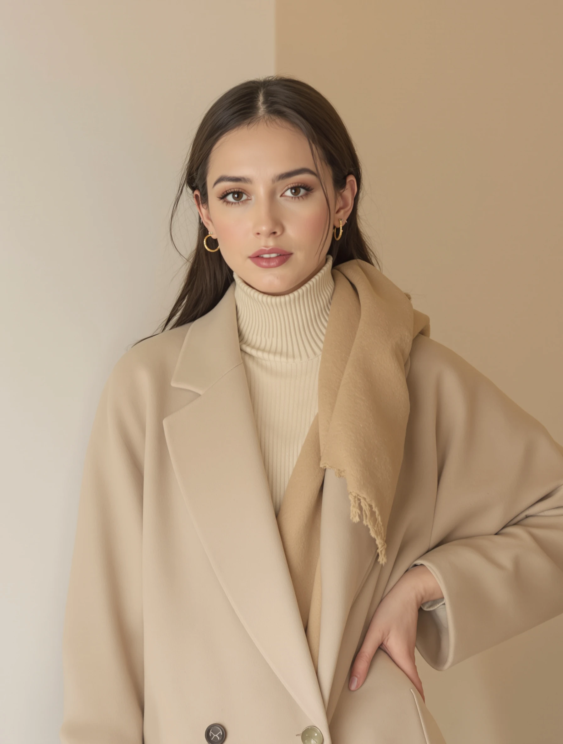
Woman in neutral palette of beige, cream and tan, tonal dressing. Subtle sophistication, color coordination, warm minimalism, refined style.
Woman in neutral palette of beige, cream and tan, tonal dressing. Subtle sophistication, color coordination, warm minimalism, refined style.
Free to Use (CC BY 4.0)
This AI-generated image is free for personal and commercial use. Just include a link back to PixelPanda.
Perfect For
About This AI-Generated Fashion Photo
On a minimalist fashion feed this works because it survives being small. A tonal beige look holds its shape in a grid thumbnail where a busy print turns to noise, and it sits next to your other posts without breaking the palette. It also photographs consistently across seasons, which matters if you post a lot and want the profile to read as one body of work rather than a scrapbook.
To recreate it, pick three neutrals within two shades of each other and separate them by texture: ribbed knit, smooth twill, brushed wool. On deeper skin tones, push toward camel, chestnut and warm sand rather than pale oat, which can wash out. For cooler complexions, swap tan for greige and stone. If you need more energy, add a single leather or suede element instead of a color.
Tips for Fashion Photography
- Keep all pieces within two or three shades so texture, not color contrast, creates the visual separation in frame.
- Match the wall temperature to the outfit; a cool gray backdrop turns warm beige knitwear slightly muddy.
- Mix one ribbed knit, one smooth woven and one soft drape so tonal layers stay readable.
- Skip logos and bright accessories; a suede belt or leather bag adds interest without breaking the palette.
Frequently Asked Questions
Does an all-beige outfit look washed out in photos?
Only if the fabrics all share the same finish and the light is flat. Use side lighting so knit and twill cast visible texture, and separate shades slightly, for example cream over tan rather than tan over tan. A darker accessory near the waist or feet also gives the eye an anchor point.
Which neutrals suit my skin tone in a tonal look like this?
Warm complexions and deeper skin tones look strongest in camel, chestnut, caramel and warm sand. Cooler or very fair skin often reads better in stone, greige, ivory and taupe, since pale oatmeal can blend into the face. Test by holding the fabric near your jaw in daylight and checking which shade makes your skin look brighter.
How do I keep a whole feed of neutral outfits from looking repetitive?
Vary silhouette and texture rather than color. Alternate oversized knits with sharp tailoring, wide trousers with slim, matte cotton with satin or suede. Change the crop too, mixing full-length shots with waist-up and detail frames of cuffs, collars and bag hardware. The palette stays consistent while each post gives the viewer something new.
Technical Details
Soft directional light from one side rakes across the fabric to reveal weave and drape, with gentle fill preventing hard shadow. Shallow depth of field softens the pale wall, and the color grade holds a warm, slightly desaturated cast throughout.